
Date of Visit : April 2013
Andreu Balius
Mila I Fontanalas 14-26 2n 2g
Barcelona, Catalonia (Spain)
http://www.typerepublic.com/
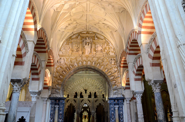
Mezquita Great Cathedral and Mosque
calle Cardenal Herrero 1, 14003 Cordoba, Spain
The Unique Arts Heritage in Spain
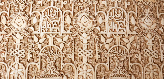
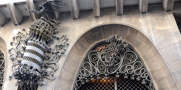
Each region of Spain has its own unique cultural and political viewpoint, however, almost all share the common influence of 800 years of rule by Muslims from North Africa (800-1492). The Moors, who referred to their holdings on the Iberian peninsula as Al-Andalus, infused their architecture and crafts with decoration as prescribed by Islamic culture: complex patterns derived from geometry or vegetation as well as elaborate interlocking calligraphy.
The distinctive style of Al-Andalusian art and architecture evolved through the confluence of two factors — geography and religion. Massive mountain ranges separated the country from the rest of Europe but it lay distant from the major Islamic centers as well. This position allowed for a community that intermingled diverse cultures along with their respective artistic traditions.
Islamic motifs were retained as part of the vernacular even after the Christian reconquest of Spain in the 15th century. The Islamic-influenced style is known as Mudejar, a derivation of the Arabic world “mudayyan”, translated as “he who is permitted to remain”.
Typography in Spain
Is there any evidence of Mudajer in Spanish typography? We will address that a bit later on, but first what is “Spanish style” typography? The term appears frequently in typographic literature but it is hard to find a solid explanation. (And there are those who strongly contest the notion of national styles.)
Printing and punchcutting arrived in Spain long after it commenced in the other parts of Europe, almost twenty-five years after Gutenberg’s bible. The first book printed in Spain was executed with imported typefaces. The printer was German, Lambert Palmert who set up his press in Valencia and quickly collaborated with a local goldsmith, Alfonso Fernández de Córdoba (presumably to fabricate type for the press). In the hands of Fernández and other Spanish metalworkers the imported type design soon acquired, as type historian Daniel B. Updike wrote, “something characteristically Spanish.”
Updike seems at a loss to explain clearly how Spanish style crept into the existing designs – only that it must have been “something about the air, the sky and the landscape that bewitched the immigrant German printers.” The Spanish style proved stealthy and pervasive, “Even the Spanish copies of Baskerville and Caslon acquired a Spanish flavor.” Updike’s vague explanations finally concede with “Like the flavor of olives, “Spanish” cannot be described.”
Andreu Balius: The TypeRepublic
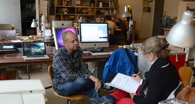
Along the northeastern coast of Spain lies the autonomous community of Catalonia and its capital, Barcelona, home of the TypeRepublic. Although the actual territory of the TypeRepublic is confined to a computer on the desk of type designer Andreu Balius (and virtual space of the internet) we were still able to enjoy a very pleasant visit there in April 2013.
We traveled by subway, surfacing near some of the city’s fantastical Art Moderne architecture, however Mr. Balius’s building on Mila i Fontanals felt straight out of New York’s Chelsea district — a clean modern building housing studio spaces for model agencies, photographers and artists. On the third floor we found Balius’s studio, part of a cooperative space shared with other designers and illustrators. After greetings and introductions we left Balius’s studio mates lunching at the communal table in the front of the studio and moved to his section.
Balius: Education and Training
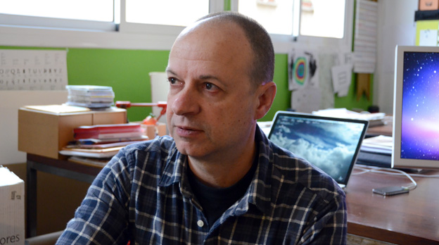
Balius is the kind of person we like to meet – a combination of very accomplished yet casually approachable. An outdoor enthusiast and avid traveler, he is also a serious student. He first studied sociology at the University of Barcelona before developing an interest in visual communication. A degree in Graphic Design at IDEP (Barcelona) was followed by another in Fine Arts (Graphic Design) at Southampton University in the United Kingdom and finally a PhD in Design from the University of Southampton UK in 2013. Balius extensively studies type history both as a personal interest and as part of his design process. To better grasp letter formation he trained with master calligrapher Keith Adams. (And another Adams link) All of these studies contributed to a personal design process, including his sociologist commitment to make all of his type design work within an appropriate social context.
We started our discussion with a quick overview of Spanish type history touching on the work of several major figures from The Golden Era of Spanish punchcutters; Eudald Pradell (1721–1788), Antonio Espinosa de los Monteros (1732-1812), Geronimo Gil. Also acknowledged were the more recent Richard Gans Foundry (active 1888-1975) and printer and typographer Ricard Giralt Miracle (1911-1994). Each is an interesting topic unto itself, but the one Balius knows most intimately is Eudald Paradell (or Edward Pradell) after creating a historical interpretation of Pradell’s work for digital use.
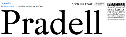
Pradell, an illiterate but a highly skillful engraver of armor, is recognized as Spain’s first punchcutter. Under the royal patronage of Carlos III, Pradell opened a foundry in Madrid to produce fonts for Spain’s Imprenta Royal. Balius’s work on Pradell earned awards from ATypI 2001 and the Type Directors Club in 2002. The descriptive blurb for the digital version on myfonts.com states “Although it is a very contemporary product, Pradell has a very distinctive Spanish flavor.” (There is no elaboration on what Spanish flavor means, not even a reference to olives or the Spanish sky.) Balius later created a customized version of Pradell, (Pradell Chillan) for La discussion, a newspaper in Chile.
Starting out in the 1990’s, when learning digital type design was not an academic option, Balius taught himself the complexities of digital media. His first type face, Temble, (a rather distorted design) was released through ITC in 1996 and is still available today.

In 1993 Balius initiated a co-operative type design community “open to anyone that wanted to take part”. The over 60 fonts offered were created in the spirit of experimentation. (Today the community goes under the name Garcia Fonts.)
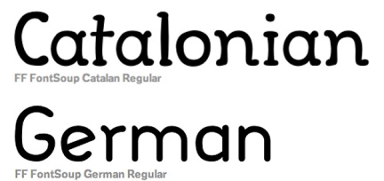
From 1996 to 2001 he co-created Typerware with Joan Calres Pérez Casasin based in the village Santa Maria de Martorelles (near Barcelona). Balius and Casasin jointly designed the whimsical Font Soup in 1997, later reworked into a German version for FontFont.
Balius: Type Offerings
Today Balius’s personal selling vehicle is the TypeRepublic, an independent foundry featuring commercially available fonts as well as a showcase for his custom work. We only had time to discuss a few of our favorites.
Elizabeth, 2005
This face, originally designed by Elizabeth Friedlander for Bauersche Giesserei foundry in 1938, is one of the few type designs by a woman before the digital age. Normally a font is identified by a designer’s last name (think Gill, Caslon, Didot, etc) but this design was created in Germany during the late 1930’s when a Jewish name was considered a liability. Friedlander was rejected for the more Arian friendly Elizabeth.
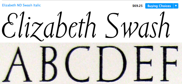
Commissioned by Fundicion Tipographica Neufville, Balius based his interpretation of Elizabeth upon specimens in an old Bauer type catalog (although the final digital version required extensive optical scaling).
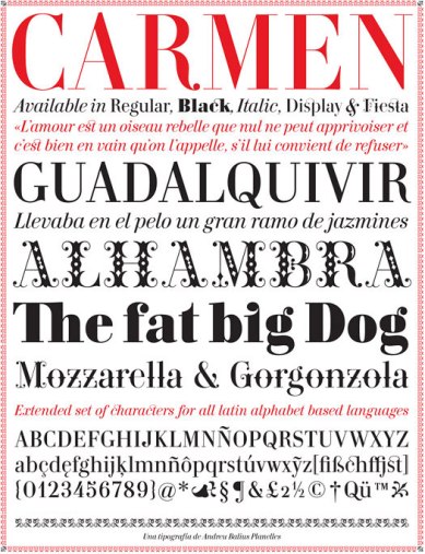
Carmen, 2007-2008
Another of Balius’s fonts carries a female’s first name however the design, entirely by Balius, reflects the passion and intrigue of the infamous Spanish gypsy. A 2008 commission for Prosper Merimée’s Carmen (1845) the design is firmly rooted in Didot, the major type influence of the 19th century.
In 2011, the sexy retailer, Victoria’s Secret, commissioned a promotion display version of Carmen. It was awarded one of the year’s best typefaces in 2008 from Typographica.org and named a Top Type of 2009 by FontShop.

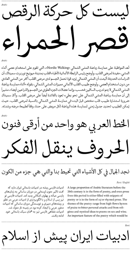
A Latin-Arabic Typeface: Al-Andalus (2009-2013)
A one-week course in non-Latin typography at The University of Reading inspired Balius to create a typeface design that would address communication between the Latin and Arabic languages used in his home country. To better understand the form and function of an unfamiliar language he studied Arabic calligraphy from a Syrian calligrapher based in Barcelona. Balius based his design on the calligraphic style, Naskh, the form most commonly used for printing Arabic.
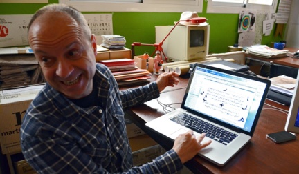
Balius designed the Arabic font to combine perfectly with his existing roman face Pradell. Al Andalus includes a complete set of characters in Arabic, including all glyphs for Farsi & Urdu, as well as a complete set of ligatures and basic punctuation.
There are so many more of Balius’s original and custom designs that we did not have time to discuss (check out his website). It is also possible to read his thoughts on type application in his book, Type at Work, The Use of Type in Editorial Design, published in English by BIS (Amsterdam, 2003).
Leaving the Type Republic
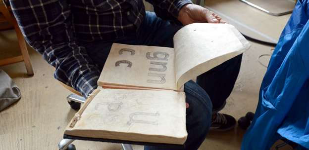
Outside of type design Balius is an outdoor enthusiast – hiking and mountain biking are his favorite activities. He also travels extensively throughout the world giving workshops and lecturing at prestigious conferences. Whether on the road for fun or work he takes along sketchbooks to record his unending flow of ideas.
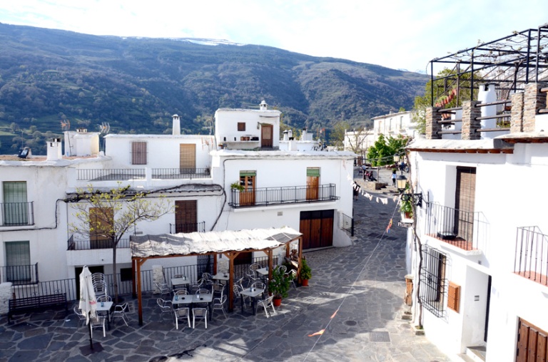
We left with a better understanding of his typography and a list of places for hiking and visiting in Southern Spain. He recommended some great hikes in the White Villages of Andalusia.
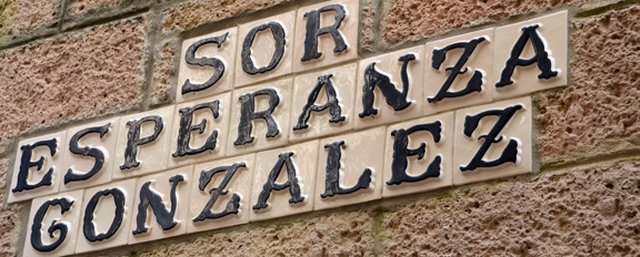
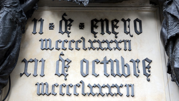
During the remainder of the trip we kept our eyes open for type designs that we felt displayed some of the decorative influence of Mudejar.
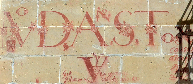
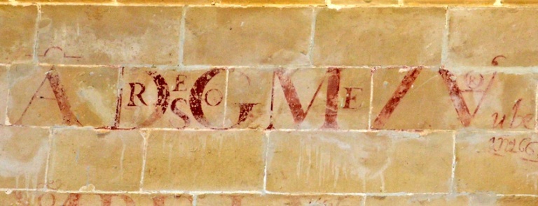
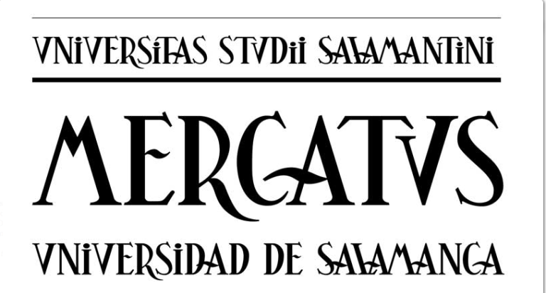
We were also intrigued by lettering that was hand drawn on the walls of a university building in the town of Baeza. Only later did we realize that Balius had created a custom typeface, Universitas, from that same academic lettering tradition.
For more of Spain and Spanish typography see our guest post on Imprenta Municipal-Artes del Libro in Madrid on Printeresting.org.
Additional Sources
Carmen image from design boom
http://www.designboom.com/design/andreu-balius-interview-10-02-2013/
Paucker, Pauline: “New Borders: The Working Life of Elizabeth Friedlander.”
(Oldham): Incline Press, (1998)
