
Imprimerie Nationale
Le Cabinet des poinçons et Atelier du livre d’art et de l’estampe
Ivry-sur-Seine, France
Date of Visit: March 2007
École Estienne
18 boulevard Auguste-Blanqui
75013 Paris
Date of Visit: March 2007
The Grolier Club
47 E 60th Street, New York
Date of Visit: December 7, 2011
Link: http://www.grolierclub.org/
Please note, all text © 2011 Design history.org.
All photos © 2011 by Designhistory.org and Charles de Limur
Some Background
We first learned about Nelly Gable, the assumed one and only female punch-cutter in the history of the world, during a type history class taught by James Mosely at the Rare Book School in 2002. Our ears pricked up the mention of her name—not only was the lecture finally including a women but she was still alive and held an important position in France’s Imprimere Nationale. Mr. Mosely distributed one of her poems, gy, or the magical journey of a punch cutter at work, which was so French, so female and so typographic that we were convinced that we should try to meet her. In the spring of 2007 we arranged to visit Mme. Gable in her punch-cutting studio (Cabinet des Poinçons) then housed temporarily in an industrial complex in Ivry-sur-Seine on the outskirts of Paris. Our objective for the visit was to record Mme. Gable’s career and perhaps document the final production base of hand punch-cutting in the world.

In addition to being the single woman in her field, Nelly Gable (b. 1957) is one of the few remaining punch-cutters qualified to instruct any future practitioners in the centuries old craft. The occupation of punch-cutting, quite simplified, is the engraving (or sculpting) of single metal letterforms in a specific size and style. This complex process is commonly believed to have originated when Johann Gutenberg used his jeweler’s expertise to cut punches, sink matrices and cast individual types. This simple invention precipitated a social and cultural revolution in the western hemisphere.
To understand the significance of Mme. Gable’s position it would be helpful to become familiar with the heritage of her place of employment. The Imprimerie Nationale, one of the most prestigious publishing houses in the world, has a long heritage of book production from its printing and type production facilities. Its origin, as listed on the official corporate timetable, began in 1538 when arts patron King Francis I assigned printer Conrad Neobar the title of “King’s Printer for Greek.” Neobar only lived until 1540 when Robert Éstienne, another royal appointee, assumed responsibility for the Greek, Latin and Hebrew publications. It was under Éstienne that the elegant royal greek types (grecs du roi) were produced based upon the accomplished work of the calligrapher Angelos Vertetios. The typographic master Claude Garamont was commissioned to cut the punches for the new font. (A longer family tree of important figures are listed later in this posting.)


The printing house has weathered a number of financial highs and lows over the past centuries. During the French Revolution its director was executed and the entire operation was evicted from its location in the Louvre. It regained importance during the period of Napoleonic campaigns when the government called upon the institution’s collection of exotic typefaces to print collateral material for use in foreign locations. During the early 19th century the institution slipped into mediocrity but by 1895 it was revitalized and resumed producing superior editions of fine print and illustration. In 1921 the establishment moved to an impressive building on the Rue de la Convention in the 15th arrondissement of Paris and it was at that location that Mme. Gable was first employed. Economic hardships in the late 20th century had serious repercussions when the management of the now privatized Imprimerie Nationale decided to sell the building placing the future of the historical printing works in jeopardy. An alarmed international typographic community sought to protect the collection by circulating a petition, Save the Heritage of the French National Printing Works, addressed to the French President.
Visiting the Imprimerie Nationale
We knew our interview would be a pleasant one since our interpreter, Mr. Charles DeLimur, had spoken with Mme. Gable on the telephone to confirm our meeting date and reported back that she was energetic and enthused about our meeting. (Mme. Gable does not speak English and our French was certainly not up to an interview so bringing along an interpreter was necessary). She met us at the RER train station and we walked together for several blocks along a street edging a large industrial complex, a rather gritty introduction to the day. She is a petite and delicate woman with a short, spiky white haircut and impressively long dangling earrings. Wonderfully dressed in a black mini skirt, black textured stockings and knee-high boots with heels, she deftly picked her way around a burned out car shell while dodging the frequently passing vehicular traffic. I would later come to seeing this walk as a metaphor for Mme. Gable and her approach to life — stylishly and determinedly making her way around daunting obstacles.

Upon our arrival at our destination Mme. Gable met her fellow employees with a quick succession of three alternating cheek kisses. We were introduced to her atelier mate, digital type designer Franck Jalleau, who was busily working at his computer screen on characters for an Arabic font. Mr. Jalleau does not describe himself as a type designer but as an ‘originator-draughtsman’ of characters. His work has earned numerous awards including the prestigious Morisawa award in 1996. Mme. Gable and Mr. Jalleau have worked as a team on projects including creating a punchcut and digital symbol (respectively) used for the euro and, in 2002, the official typeface for the French city of Brive-la-Galliard.


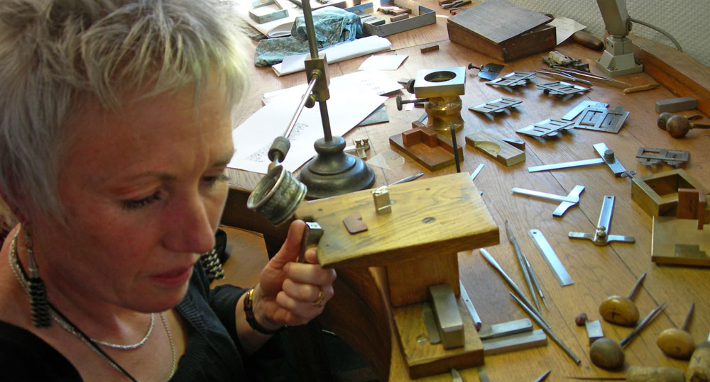
The punch-cutting and design studio is located on the second floor of the building — a long rectangular room with one side comprised of large windows overlooking an industrial parking lot. Along the windowed wall is a massive worktable (établi) from which two semi-circles have been removed to allow the punch-cutter to sit partially encircled by the table. The work surface is covered with a myriad of instruments for punch-cutting, many of which were outfitted with champagne corks as handles.
We began our discussion by reviewing Mme. Gable’s life prior to her work as a punch-cutter because we were curious how one prepared for this specialized occupation—no schools offer a course in punchcutting. Mostly taught through apprenticeships under a master punch-cutter, one still needed to arrive with the appropriate skill set for intricate metal working. She was amply prepared having taken a double foundation in Industrial Design at the École Boulle in Paris. The school, named after the 17th century French artisan Andre-Charles Boulle (cabinetmaker and sculptor to Louis XIV), was founded in 1886 and has built a reputation for turning out highly qualified students for the applied art and design industry. Mme. Gable undertook a range of studies including classes in metal engraving and furniture studio course before specializing in the art of miniature metalworking. In the midst of her studies she began working as a jewelry designer for Murat in Paris, designing and sculpting various small pieces of jewelry. During this period she developed a fascination with masks and she produced a series of jewelry pieces based upon African and northwestern American native motifs.

Nelly Gable’s Early Years at the Cabinet des Poinçons
Nelly Gable entered punch-cutting professionally in 1987 when the impending retirement of a punch-cutter at the Cabinet des Poinçons necessitated a search for a replacement. The management of the Imprimerie Nationale contacted her school and Mme Gable’s name was suggested. There were two other women in her class at the École Boulle who worked in metal but neither of them was experienced in miniatures. She was invited to compete for the position and was given a very rigorous examination involving the cutting of a small and thin Didot-like letterform. Her superior performance outshone her competition and she became, unknowingly, the first woman in history to work as a punch-cutter. At the start of her new career Mme. Gable was thirty years old, married and the mother of a one-year-old child.
Her introduction into then all-male workplace required some adjustments both by Mme. Gable and by her new employers. It soon became clear that the management was somewhat vexed that their new employee was a woman and they placed certain stringent conditions on her employment. One condition was that she was not to have another child in the first three years of her employment. She complied with this and waited until 1990 to have her second child and her last in 1993. During these years there was a suspicion in the management that she would not persist at her position because in France, at that time, a woman could fully retire with the combination of fifteen years of work and a third child. (She discovered a notation in her personnel file saying that management should not be fooled because she would most certainly leave after her last child.) Working under such a prejudice still did not prepare her for the shock she received after she returned after her third maternity leave — she found her name had been summarily removed from her workroom door.
Apart from the childbearing issue there were other points of contention that arose from her gender. The first issue of concern was her mode of dress. Traditionally the men in her position wore plain black over-jackets with white shirts and ties underneath. She arrived on her first day in a multi-colored ensemble with her customary large earrings (that particular pair had feathers), which prompted her new boss to suggest that perhaps it wasn’t possible to work in such attire. Mme. Gable, deciding that she was not going to don a black coat and fade into the woodwork, did not compromise her clothing choices and eventually the issue became moot.
In general her workplace, as at most large institutions, was mired in bureaucratic policies that rigidly defined each employee’s work parameters. She felt that her ceiling as “not a glass one but rather a steel one” to emphasize the amount of perseverance and stamina it took to introduce change into her workplace. An especially difficult challenge for her was to gain permission to learn skills that lay beyond the punch-cutter’s bench. She wanted to train on the machinery that was used for both the preliminary and finishing stages of punch making but all of this equipment was located directly below her on the ground floor and the heavy stratification of workers did not allow for the intermingling of the departments. After ten years of requests she was finally granted permission to learn how to use the machine shop equipment. Her training began with traditional introduction of an apprentice machine worker — with her thoroughly cleaning each machine.

During our visit Mme Gable led us down to the ground floor of the building to the print shop where there was a vast array of mechanisms for casting and composing type, letterpress printing, lithography, copperplate engraving and collotype. At that particular moment the shop was animated with the clacking sounds of a Monotype machine casting type and several presses in use. Here we saw a demonstration of her expertise with machines that squared up and metered the steel bar in preparation for becoming a punch plus a demonstration of striking the matrix. The striking process is not done with a hard blow but by placing a finished punch in a device that slowly presses the punch into a copper bar. Mme. Gable has mastered all of the equipment necessary to take a punch and matrix through all of the stages up to, but not including, the casting of the type. If she had not persevered in her additional training it is not clear who would retain the working knowledge of these processes because it was not apparent that anyone else remained that knew the complete method of production. The walls of the print shop are lined with shelves full of packages of cast fonts of the famous French typefaces. We viewed the original steel engraved plates of the characters of the romain du roi. They were being printed as a set of limited edition prints — part of the effort to find ways to help salvage the collection from financial exigency. Elsewhere in the pressroom bookmarks designed by Mme Gable using characters from the Chinese character collection were in the process of being printed. A lithographic press was being readied for giclée gelatin printing.

We broke from the interview to lunch with several of Mme Gable’s co-workers. Even though we were in a very industrial area it was still France and therefore a nice neigborhood restaurant was within a short walk. Over a glass of red wine and country duck we listened to Franck Jalleau discuss the digital translation of the type faces he was mining from the historical collection. There was plenty of lively joking and teasing between the group who obviously are closely knit and seemed to have no issue with working alongside a woman.

Afterwards and back upstairs in the Cabinet des Poinçons, Mme. Gable described her early training under the master punch-cutter in the atelier. She started out cutting larger type sizes, about 42 points. For the first five years in the atelier her work was reviewed by the senior punch-cutter, Christian Paput, who would make some final refinements and strike his name into her work. She moved on to progressively smaller sizes until she reached 12 points. [Note: The point sizes mentioned here are Didot, which is somewhat larger than the American and English point sizes]. Because of her previous training she was able to skip the first year of unpaid apprenticeship and begin her first year of training with a salary. Today, having climbed through all of the levels of punch-cutting categories to Chief Graveur, she ponders the possibility of attempting the next level described as “out of category.” It is the sort of challenge that beckons to Mme. Gable.
The French Punch-cutting Process
The materials for type production are a steel punch, a copper matrix and the type metal made from an alloy of 70 percent lead, 5 percent tin, 25 percent antimony. Through Mme. Gable’s demonstration and explanations we were educated in the steps of the French method of punch-cutting, a process entirely accomplished by subtractive carving and filing. First a steel bar is prepared in the appropriate size for the point size being cut. (It goes through several stages of tempering and squaring before the process begins). A letterform is sketched or transferred onto the end surface of the steel bar and the outside of the bar is filed down to angled edges with successively finer files until there remains just the flat area that will comprise the letter. The files are then held at angles to make inroads into any areas to be removed and, when filing no longer is possible, the punch-cutter uses a graver to dig out the rest of the letter. Ever so tiny slivers of metal are removed. At successive stages the letter is tested by making a smoke proof (fumé), a print made from a film of soot collected on the end of the punch. The soot is collected by holding the punch over the flame of an oil lamp, the ‘lampe pigeon’. Then the letter is pressed onto paper, making a crisp impression of the emerging letter and corrections are made as needed and proofed again. The whole process is painstaking, exacting and time consuming.

In other countries the punch-cutting method varied in that the letterform started with a counterpunch.(The counters are the negative shapes inside the letter such as the opening in a letter ‘o’.) The counters are formed by striking tiny round or oval shaped punches into the surface of the punch as opposed to the French method of digging with a graver. Counter-punching is a practical method because it is speedier than digging and allows for uniformity in the counters across an entire font. The French method demands that the punch-cutter make more individualized decisions concerning counter forms, which in turn affects the final design of the font.
Mme. Gable’s favorite fonts to cut are the ones that are the least perfect and cites the font Luce as an example. Because Luce is “not so perfect but lively and poetic” she needs to bring all of her talent into keeping it true to the original design. Fonts come in a number of sizes and weights, often including italics, small capitals, ligatures, decorative symbols and special characters. Every single letter of every size and weight is cut separately therefore a set of punches for a complete font could easily take a year or more to complete. During the twentieth century punch-cutting by hand has been eclipsed by faster processes and there has been no call for a new font for many years. The last complete font cut in the Cabinet des Poinçons was Le Gauthier, by the late Louis Gauthier just before he retired in 1979. Apart from her recent production of a specialty font for Brive la Galliard, Nelly’s punchcutting work is concerned primarily with repairing and replacing the punches in the collection.
Preserving the Patrimonie of the Cabinet des Poinçons

Despite the considerable expense and efforts to reinstall the workshops into the new location, the Cabinet des Poinçons and the historical printing works still have an uncertain future beyond 2012. Nelly’s most important task is finding ways to preserve the collection and to secure its future. The first solution would be to make the continuation of workshops financially viable through specialty print production. As a first attempt she designed and published a series of six books entitled Suite Pastoral 10 in 2003. Each book is a thematic homage to the masters of French engraving in the 19th century combining wood engravings with hand set type from the collection. The whimsical and charming type exercises are still available for purchase from the Imprimere Nationale.
The workshops are promoting themselves as a unique historical press in an impressive brochure, La mémoire vive de l’ecrit, which extols their special capabilities. A list of the exclusive historical typefaces: Garamont of François I, Granjean and Jaugeon of Louis the XIV, Luce of Louis XV, le Didot of Napoléon I, Marcellin-Legrand of Charles X and Gauthier of the 20th century confirms the pedigree of the shop’s type inventory. The collection also includes a number of faces acquired at the closing of the Deberny & Peignot type foundry in 1975. With her extensive knowledge of the collection Mme. Gable feels that there are an inexhaustible number of fonts in residence that would have great potential for digitalization and could be a strong new source of revenue.
If a commercial venture is not viable there is hope that the government can be convinced to preserve the workshops in the same manner as the Plantin-Moretus Museum in Antwerp, Belgium and the Workshops and Museum of Printing Art in Leipzig, Germany have been able to successfully make the transition from industrial production to working museums. There is also the possibility that preservation can be made through a liaison with an educational institution.
A Visit to École Estienne

Franck Jalleau teaches font design in the Typography Design Studio at L’École Estienne and envisages a link between the Cabinet des Poinçons and the school. The two-year typography program, initiated in 1992, offers an applied arts degree to approximately 40-50 students annually. He invited us to visit his class and tour the excellent typesetting, printing and computer facilities.

 On the day of our visit we observed Professor Margaret Gray’s typography class in session and Ms. Gray explained how their process of teaching font design is borne out of a combination of classes in calligraphy, typography and digital design. I asked her why she thought continuing the practice of punch-cutting is important in our computer age and she responded:
“Traditional typesetting (lead) is still interesting for its material value. Why do we have offset and silkscreen and numeric printing? It’s the same question… Their qualities and effects are different and are applicable to different situations. It’s a luxury item to be sure. But there are plenty of luxury items on the market! It is also a valuable tool and an enriching dimension for analyzing historical fonts. Their sculptural quality is intrinsic in font design. Drawing, sculpting and engraving do not produce the same results. But they are all parts of type design, its origins and evolutions.”
It is easy to see how the punch-cutting studio and wealth of historical information from the Imprimerie Nationale’s historical workshops would be an invaluable addition to a type design program. Although she is optimistic about the future, Mme. Gable realizes that preservation of the entire Atelier du Livre d’Art et de l’Estampe is going to be very difficult. All of the ideas described in the previous paragraphs have been proposed but they have not yet gained enough traction to secure a serious commitment from either the French government or a private organization. She has however rallied many supporters and there has been an influential group formed to explore and promote solutions for the future. (There are currently some plans to try to move the entire collection to Caen in Normandy.) When we parted from Nelly Gable that day we took the memory of her warmth and energy and felt assured that she was absolutely the best person to tackle the challenges ahead.
Nelly Gable at the Grolier Club
Treasures from the Archives of the Imprimerie Nationale es Poinçons
Fast forward 4 years to the Grolier Club in New York City. (For the unfamiliar the private club was founded in 1884. It houses a research library and organizes exhibitions, lectures and workshops on printing history that are open to the general public.) Currently and through February 4, 2012 the club is presenting Treasures from the Archives of the Imprimerie Nationale. The exhibition, curated by H. George Fletcher is also memorialized in a handsome hardbound catalogue printed at the Imprimerie Nationale and available for purchase. Large showcases hold well-preserved type making artifacts and beautiful rare books printed at the Imprimerie Nationale and clear explanations outline its various historical periods. If you are at all curious about the historical process of type making or printing this would be a wonderful introduction.
Traveling to the exhibition was really unpleasant, there was a driving rain made even more miserable by the endless throngs of tourists and shoppers clogging midtown Manhattan in the pre-holiday frenzy. Once inside the club doors off Madison Avenue however everything was calm, welcoming and dry. We started with a research stop in the library with some books that had been thoughtfully pulled by librarian Meghan Constantiou. She introduced us to Mr. Fletcher who recounted his visits to Imprimerie Nationale as well as some details about the printing of the exhibition catalog. He would act as Nelly’s translator for the audience gathering to watch the punch-cutting presentation. We moved downstairs to the exhibition hall which featured a large table covered with all of the accoutrements for making punches. A steel bar, lampe pigeon, files, calibration devices, etc. Nelly was introduced as the French movie star punch-cutter, and brought some continental glamour with a bit of flame red camisole peeking out over her black jacket. Nicely done. Again we felt a bit drab in comparison.

The presentation explained most of the processes we had seen in Ivry-sur-Seine but mostly through explanation or picture. Unless you see the process in action it is almost impossible to grasp the delicacy of punch-cutting. It may have helped the audience when they read Nelly’s poem, gy, that was printed in France and distributed to them as a gift. The last sentence reads, The shoulders “mirror polished,” the gentle inclines that safeguard a particular angle, the fragile yet vigorous swelling of the curves, what a plentitude of forms:It is monumental, a thing of beauty, a typographic punch.
Written by Nancy Stock-Allen

Update 2014
Gable is still working with the collection although it has moved to Douai in northern France for the time being. There have been reports of plans for yet another move of artifacts and staff to Normandy, to the site of the publishing archive IMEC (Institut Mémoires de l’édition contemporaine) near Caen. It remains to be seen if this ever materializes.

Reblogged this on Press Genepy and commented:
An inspirational and truly unique woman! Thanks Nancy for this atricle.
Really enjoyed this article, wow the whole history and process of punch cutting is fascinating…Nelly certainly works against the odds. I hope the whole art of this amazing craft can be saved. My son sent me this article, I hope ge gets to visit the museum/workshop one day.