Date of Visit: October 2011
Location: Fairfield, Pennsylvania
Associated Link: Washington Calligraphers Guild
All images copyrighted, photos by Eric Allen
If after 5 years of study one can become proficient in calligraphy and after 15 years of practice a master, what level is obtained after a 60-year career? According to Hermann Zapf in the case of Sheila Waters you become the Queen of Calligraphy (or so he inscribed in a dedication to her). Our visit to Mrs. Waters’ studio convinced us that Mr. Zapf was correct plus we would additionally suggest the titles of calligraphic granddaughter of the legendary Edward Johnston and the mother of calligraphy in the United States.

The Waters’ Residence
Normally we visit destinations that are open to everyone but this trip was a special glimpse into the private world of master calligrapher Sheila Waters. Our drive to the Waters’ residence in southern Pennsylvania brought us to the gently rolling foothills of the Blue Ridge Mountains, warmed in the autumnal glow of late October. Peter and Sheila Waters built their home overlooking those hills shortly after Mr. Waters retired from his position as the Chief of Conservation at the Library of Congress in Washington, D.C. The couple had one of those special marriages in which distinct yet complimentary talents created an even stronger whole. Mr. Waters, considered the father of American library conservation, was a master bookbinder and an innovator in book conservation. His techniques saved priceless manuscripts and rare books after the flooding of the Arno River in Florence, Italy in 1966. For three months Mrs. Waters assisted her husband by editing, drawing plans and elevations for equipment plus hand-lettering the treatment and condition cards used to describe each item reclaimed for the National Library in Florence. He in turn would critique and make design suggestions to his wife’s calligraphic compositions. Although Mr. Waters passed away in 2003 his spirit is still evident in his beautiful book bindings and his career continues to be honored by his wife at various events and speaking engagements (most recently at the National Gallery of Art in Washington, DC on the observation of the 45th anniversary of the floods).

Early Life
Born Sheila Salt in 1929, Mrs. Waters was one of the many London area children evacuated to the English countryside during World War II and it was in that period that she displayed her first formal hand lettering on a poster for the war effort. Seeing what her twelve-year-old hand produced was interesting, unfortunately not the first prizewinner but given meritorious notice. We were also able to view a nice selection of her earliest work demonstrating her strong skills in drawing and design.

Sheila’s formal art studies began at Medway College of Art in Rochester, Kent where she elected several different areas of study. An extremely driven student (with the modest goal of becoming one of the best women artists in the world), she compressed the first two years of courses into one, followed by a year in which she studied stone and zinc-plate lithography, typographic design, book binding and hand type setting. In her last year she concentrated on calligraphy, which she characterized as “an epiphany.” (She was compelled to learn more about calligraphy after being hired to letter a sign declaring “No Tomatoes Today”!) To earn her national design diploma she completed some rather rigorous final exams: a three hour written exam on the history of writing and illuminating manuscripts and an intense design challenge completed in two weeks time.

An important element in her education came during six months of weekly study visits to the British Museum where, despite being only 18, she was given special permission to observe and copy directly from the priceless manuscripts, including the 7th century Lindisfarne Gospels. One can see how the ancient manuscript’s letterforms, displays of color and control of intricate decoration influenced her later work. At age 19 Sheila was awarded a scholarship to the Royal College of Art where, along with her entire first year class, she attended the required Wednesday calligraphy class of Dorothy Mahoney. Mrs. Mahoney had been a teaching assistant to Edward Johnston (1872-1944), the man most credited with the revival of fine calligraphy during the Arts and Crafts period. Johnston’s teaching method, based on his reconstruction of the principles of formal writing, was primarily carried forward by women: Anna Simons (1871-1951) in Germany, Irene Wellington(1904-1984) at Central School of Arts and Crafts in London and Dorothy Mahoney (1902-1984) at the RCA. Mrs. Waters’ interest in calligraphy developed into a career choice despite the derision of other studio teachers who undervalued calligraphy as “Dorothy’s knitting.” Perhaps that sort of prejudice is the reason that the calligraphy classes were primarily female.

Mrs. Mahoney taught in the same room in which Johnston lectured and she drew demonstration letters on Johnston’s original chalkboard. Mrs. Waters recalls her teacher as a forthright and trustworthy individual with an upper crust accent that was sometimes the object of student impersonations. Mahoney’s strength was her spot-on critical eye, equally strong for calligraphy as well as all other artistic mediums. Her calligraphic style diverged from Johnston’s in that Johnston moved toward a condensed hand but Mahoney preferred the more open Italian Humanist italic and Roman minuscule. Today one does not hear much of Mrs. Mahoney, most likely because she was primarily a teacher and she was practicing her craft in a time when calligraphy was losing ground in typography and design studies.
Professional Life in England
Shortly after graduation Mrs. Waters’ professional career began to flourish. She was inducted as a fellow into the prestigious Society of Scribes and Illuminators, a group founded in 1921 by Johnston’s students. Additionally Alfred Fairbank (the father of modern italic handwriting) hired her as one of 10 scribes who produced the Royal Air Force Roll of Honour memorial books. Over the next twenty years she worked with Hans Schmoller, (typographer and successor to Jan Tschichold at Penguin Books) by designing and executing a myriad of maps for various publications. The work was entirely hand done and often involved her combining information from typographic maps with the author’s text and then hand writing the names in italic or Roman minuscule. One particularly immense project, The Campaigns of Napoleon for MacMillian publishing, required 73 maps, 43 in two color separations and one with multiple overlays on frosted mylar. Seven exhausting months of long days and late nights paid off when the maps were singled out for praise in Paul Standard’s book review for The New York Times. Not only was her professional life booming during these years, her marriage to Peter Waters was blessed with three sons—a period she describes as her most productive.

Teaching & Commissions in the United States
In 1971 Peter Waters was appointed Chief of Conservation at the Library of Congress and the family immigrated to the United States on the QE2. With the previously unknown security of a regular paycheck a home was purchased in Bethesda, Maryland. A year later Mrs. Waters started a calligraphy program for the Smithsonian Institute’s adult classes as well as her own private instruction where she built a stable of calligraphers. In 1976 she organized a group of her students to create the Washington Calligraphers Guild, now over 500 members strong. In 2009 a special exhibition “Sheila Waters: A Retrospective, 60 years in the Calligraphic Arts” was mounted in Strathmore Hall Arts Center, Bethesda MD. A comprehensive fully-illustrated journal was designed using a custom digital typeface (not yet available) created by Mrs. Waters’s son Julian Waters, himself a master calligrapher and frequently a teaching partner with his mother. However, Julian’s well-known typeface Waters Titling, designed for Adobe, is available for purchase. (Information on obtaining copies of the Retrospective journal can be directed to this email address, waters_sheila@yahoo.com.) Both Julian and his mother have been asked for advice from digital designers who are trying to create believable script typefaces for use on the computer. They generously help despite their growing resignation that more digital scripts will mean less potential for their hand lettered commissions.

 Among more than 200 pieces in the exhibition were four of the most important highlights of her career:

1 Under Milk Wood
Sheila’s famous manuscript of Dylan Thomas’ radio play Under Milk Wood. A private commission from Edward Hornby in 1961 was finally completed in 1978 (life had a way of getting in the way of completion). Remarking on the seriousness of this commission she noted, “ I realized that this major work would outlive me and in another 500 years I would be evaluated by the quality of the work alone.” The text was executed in her personal adaptation of Carolingian and decorated with 25 of her illustrations. The actual manuscript is now in the Wormsley Librarycollection of the late Sir Paul Getty in the UK.

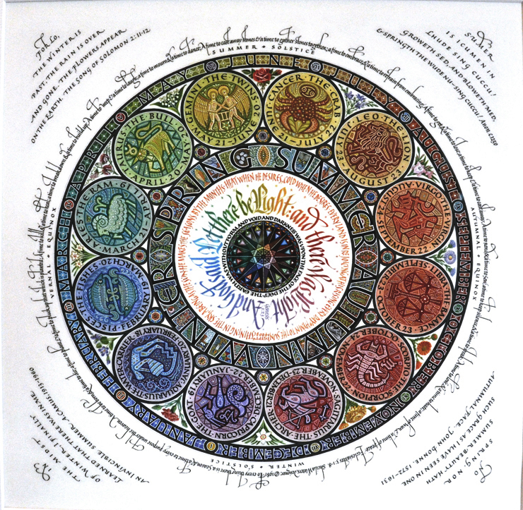
2 Roundel of the Seasons
Produced in 1981 this work is considered her masterpiece. The calligraphy, color selection, miniature painting and design were produced after 1,000 hours of concentrated work. The process was not easy, there were times that she was discouraged and debated not finishing but suggestions from her husband helped her strengthen the final piece.

3 Tor House
Numerous weights and textures were used to reflect the emotions in Robinson Jeffers poem.
4 Foundations of Calligraphy
Ms Waters’ influential textbook Foundations of Calligraphy, (2006). Reprinted 2008.
The study and practice of calligraphy has gone in and out of vogue as part of design studio curriculums over the past century. (While we were attending grad school the emphasis was not on letterform but on moving letters, words or paragraphs around inside of a square or rectangle to get the right composition. There was little or no discussion of letterform creation.) Currently however there is a surge in experimental lettering and digital font creation—with or without instruction in calligraphy and calligraphic history. Mrs. Waters advocates for preserving our calligraphic heritage by practice, not just by viewing historical documents. “We have to take care of the core of the art form we love so much and hand it on unspoiled to the next generation.” For those who wish to really understand lettering it is important to undertake serious study and for that there is no equal to Sheila Waters’ text, Foundations of Calligraphy.
We asked her advice for the novice who is interested in building a solid calligraphic base and were told that the best route is to learn all of the basic historical hands. She has concerns about the viability of calligraphy as a career in the age of computers but there seems to be no end to artists who practice the art for the sheer joy of making letters. (Here is a short clip of a her discussing pen angles)
Currently Sheila conducts weeklong intensive master classes for invited or recommended students who arrive from all parts of the globe to study in her studio. An Epson projector has replaced the Johnston’s chalkboard method but her techniques remain as grounded in tradition as her former teacher’s. The studio is spacious and well lit with individual workstations and plenty of books, displays of Mrs. Waters’ work plus treasures such as rubbings and a stone engraved sample by Edward Catich. A nearby kitchen and table provide the class with a break area and all of the students have accommodations in the large house. Gourmet dinners are catered and served upstairs in the evening. Additionally her schedule includes workshops away from home, such as at Camp Cheerio and the annual international conferences.

It is impossible to overvalue the impact of Shelia Waters on contemporary calligraphers or the current understanding of calligraphic lettering. With 20 years of summer workshops, the Smithsonian classes, the Washington Guild, her private classes, her articles for Letter Arts Review and her textbook, she has done as much as humanly possible to pass on the legacy of traditional calligraphy.


Six hours after our arrival we drove away armed with a copy of the beautiful retrospective journal and also a copy of Foundations of Calligraphy carrying her favorite inscription.


What a splendid blog! There is one tiny correction, however – the inventor of the waffle sole was legendary University of Oregon track coach Bill Bowerman. Tom is his son. Your fine section on Sheila brings back fond memories of classes at her home.
I was very fortunate to take a course with both Sheila Waters and her son, Julian in the early 1980’s, Sheila was very strict, exacting and chock full of wonderful information. I still have some of her alphabet handouts. I remember her showing us her Roundel of the Seasons and Under Milk Wood Cibachrome II reproductions, a process which her husband had developed. They were beautiful.
I had the privilege of studying calligraphy in the 1980s with both Sheila and her son, Julian. My foundation these 30+ years later is ingrained in who I am. What a beautiful post!
Thoroughly enjoyed this article! I join the many who count among our blessings the opportunity to know and to study with Sheila. She is a masterful artist, a patient teacher and a remarkable woman.
I was instantly attracted to Ms. Water’s art the first time I saw it. I am working on ordering her “Foundations of Calligraphy” and viewed a video I watched on Youtube today. I just read that Ms. Water’s maiden name is Salt, same as mine. My father born in Stoke-on-Trent. Could we be related? That might explain my artistic background.
Thank you!
Soy un Admirador de la caligrafía y considero que es la mejor.