September/October 2011
1. Marina Soria Studio
Palermo District, Buenos Aires
Link: http://www.marinasoria.com.ar/
2. Yani Arabena (with Guille Vizzari )
Link: http://www.yaniarabena.com.ar/
3. Eloisa Cartonera Cooperative
La Boca District
Link: http://www.eloisacartonera.com.ar/
4. Evita Peron Museum
2988 Lafinur Street in the Palermo
Link: http://www.evitaperon.org/eva_peron_museum.htm

While macho gauchos rule on the Argentine pampas there is a decidedly female presence in the city of Buenos Aires. With the upcoming elections looming large the ubiquitous campaign posters of incumbent president Christina Fernandez de Kirchner remind us that Argentina had the first non-royal female head of state in the western hemisphere. In the 1940’s Evita Peron, wife and women’s rights advocate, established the first government humanitarian aid and social support programs for the struggling Argentine underclass. Today grandmother activists picket weekly to bring attention to their “disappeared” children and grandchildren, (victims of earlier police regimes). During our visit we decided that it was fitting to visit with Argentine women artists and designers of the city.

1. Marina Soria Studio (all images copyrighted)
Marina Soria is a calligrapher/artist who frequently is the sole Argentine (or for that matter South American) representative of her field to the outside world. She was first awakened to calligraphy as a fusion between her fine art painting and graphic design when a guest artist, Carole Johnson, demonstrated calligraphy in a graphic design class at the University of Buenos Aires. Soria was able study for a short time under Johnson who left behind a Xeroxed copy of a calligraphy instruction book when she returned to the US. (Books on calligraphy instruction were rare in Argentina)
Despite a successful career as a graphic designer in an advertising office and teaching typography and layout at the University of Buenos Aires Soria’s heart was yearning for calligraphy. In 1998 she traveled to San Diego to attend her first calligraphy conference where she took classes with Sheila Waters and Thomas Ingmire—all while 6 months pregnant with her third daughter. Describing Ms. Waters as the essential link between Europe and new world calligraphy, Soria has a deep admiration for Ms. Waters’s work and was thrilled for the chance to learn strong traditional calligraphic foundations. A complement to that traditional work was Soria’s study under Mr. Ingmire, a pioneer in experimental, non-traditional calligraphic styles. After these initial inspirations Soria continued her studies for the next 15 years later—including classes with Brody Neuenschwander, Ewan Clayton and a year of sumi-e brush painting and many more international workshops. She gravitates to free and expressive work—for her staying inside the geometry of traditional letterforms is “like trying to dance inside a cube.”

We arrived at her Palermo district studio on a day full of diversions: two of her daughters had broken their collarbones on a recent ski trip and were just out of surgery, she had taught a class earlier in the day and she needed to get her third and youngest daughter to an appointment in a few hours. Nonetheless we had a lovely, unrushed visit (the sort of thing only an experienced mother and teacher can pull off). Marina’s studio space, an oasis of calm in the city, is open and light with several small rooms off to the sides of the main area. Her bookshelves are full of volumes about calligraphy, typography and art and her chalkboard was full of letter formation and stroke patterns drawn for her students. She prefers serious long-term students and her teaching is not in regularly scheduled classes but rather as individual projects executed on a cooperative schedule worked out between teacher and student. Once she was challenged to teach calligraphy to a fine artist who only wanted to know the forms of letters for a special project. While able to write a letter the student was not able to combine them into a word or a sentence. What Soria took away from that experience was that the essential basis of calligraphy is a system, not individual shapes, and she urges all calligraphers to get the system right before going off in experimental directions.

We asked her if there was a unique Argentine letterform, and if so what sets them apart from European? Soria answered that Jesuits brought their calligraphy from Europe since there were no indigenous Argentine scripts. The European gothic lettering was then blended with indigenous motifs.
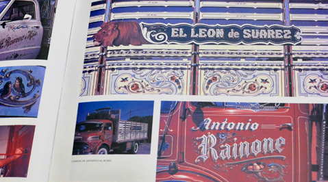
The only precursor of calligraphy could be found in the ancient tradition of the flourishers, “el Arte de los Fileteadores,” or ‘arte porteno.’ This craft basically decorated and ornamented wagons, trucks and buses with fillets, calligraphic writings, specially gothic, flourishes and zoomorphic figures mixed with popular icons of the Argentine (such as the tango singer Carlos Gardel, patriotic symbols and religious motifs. [Check out Alfredo Geneovese’s site for a full explanation http://www.fileteado.com/index.php .] During the mid-1970’s the ornate letterforms were banned by the government as unreadable but now they are reemerging on restaurant signs and in touristy areas. Even if there are less examples of this art, “fileteado” is celebrated as a trend of Argentine style. These letterforms add to the period feel of downtown where one can still ride a wooden subway from 1910 and shop in elegant Victorian buildings.

To promote calligraphy Soria and several others formed the first calligraphic group in South America, the Calligraphers of the Southern Cross (1997-2006). The group was instrumental in promoting calligraphy as an art as well as influenced several college design courses to include calligraphy in their curriculum. Despite a current surge in popularity there is no calligraphy collection in any major museum in Argentina. Soria’s work has been exhibited in the 2010 and 2011 National Textile Show, the International Book Fair in Argentina and in numerous art galleries. It is possible that her work is more known outside of Argentina where it has been shown in numerous important venues and is included in major museum collections in Berlin and Moscow. [For her exhibition list see http://www.marinasoria.com.ar/eng/muestras.html_]

Soria feels that the growing popularity of calligraphy comes from the “rarity of the human made mark. We are accustomed to machine-made marks and take their perfection for granted, however because we are human, with hands and eyes that need coordination, we appreciate when we see creations made by other humans. Whether it is dancing, playing a musical instrument or calligraphy, we know what our own anatomy is capable of performing and, from that reference point, we can gain respect for what other humans accomplish.”
Her biggest challenges come in the evolution and development of her personal style as well as not overly impressing her style on her students. She tells them, “Don’t worry as much about being good as being yourself.” For Soria, and for most calligraphers she knows, calligraphy is a spiritual pursuit, almost like a dedication to the OM. Certainly after our visit with Ms. Soria we were feeling centered, relaxed and content before we spilled back into the busy afternoon streets of Buenos Aires.
[That night we went tango dancing at a milonga (a dance hall with classes and free dancing sessions)… even on weeknights the milonga starts about midnight but the hour is fine since Argentine dinner is at 10 or 11pm. The food is terrific and inventive. Malbec is the drink of choice to accompany all of that Argentine meat. Then we flew to Salta for a week to experience both the amazing landscape and the Inca culture. No calligraphy but tons of handsome textiles, humitas, llama steak, more wine…)

2. Yani Arabena and Guille Vizzari

Over coffee in a bookstore in Palermo with the young design team of Yani Arabena, a designer and calligrapher, and Guille Vizzari, a designer and typographer, we learned the genesis of couple’s collaborative work. Yani graduated from the University of Palermo, whereas Guille has a degree from the University of Buenos Aires. It was Yani (pronounced Johnny in English) who suggested the pair work collaboratively by sharing one sketchbook, one taking solo possession of the book for one week and then exchanging it with the other for a week. There were no restrictions other than they had to build upon the other’s work and could not remove any mistakes. About half way through the book their romance blossomed and enhanced their synergy. Now Yani initiates their joint projects alone with her calligraphy, leaving blank spaces for Guille to fill with illustration or hand lettering. Guille then scans and digitizes their hand drawn work into Illustrator, striving to maintain the freedom of the lines and calligraphy.
Since calligraphy was not offered in her school Yani was fortunate to have the opportunity to study under and then become the teaching assistant of Silvia Cordero Vega. Vega had studied under Brody Neuenschwander and it is easy to see their artistic influences in Yani’s work. For inspiration today Yani follows the work of a number of expressive designers, letterers and calligraphers; Jessica Hische, Marian Bantjes, Yves Leterme and Laura Varsky. On the traditional side she admires the work of John Stevens, Sheila and Julian Waters and to expand her knowledge base in traditional calligraphy she traveled to Camp Cheerio in North Carolina for a calligraphy camp in 2010 (www.calligraphycentre.com).

Guille’s cites Herb Lubalin as one of his greatest influences, lamenting the fact that it is so difficult and expensive to get books of Lubalin’s work in Argentina (he especially desires to see Lubalin’s Blue Book in person). Because Guille has a firmer grasp on English he described to us the graphic design program and the teaching methods at the University. The department has an enrollment of 300 students, all attending entirely tuition free, and (from what we could understand) are all instructed in one large common area by numerous teachers. It is normal for design instructors to begin teaching for several years without receiving pay. The couple team-teach Typography I in the first year of the 4-year program off of the computer. Students use vinyl rubs down letters to learn technicalities of typography (anatomy, letter spacing, etc.) In the second semester computers are introduced for more experimental work. Another course named “morphology” covers composition, color and theory. Two semesters of the history of graphic design are required.
It was wonderful to meet these young designers who are so energized and committed. Their work has started to be recognized outside of Argentina, recently they participated in an exhibition of silkscreened posters at the Chicago Art Department (http://www.chicagoartdepartment.org/2011/03/powerinnumbers/). To Yani and Guille, color, energy and the rhythm of Argentine life sets their country’s typography and calligraphy apart from the rest of the world. When asked about the typography community in Argentina we are assured that typography and calligraphy are gaining a lot of interest through organizations dedicated to the profession. The first Argentine type conference Letter.2 was recently held in BA on October 4th and the largest design conference in South America, TMDG, occurs annually every October. Certainly if the energy and enthusiasm of Yani and Guille are indicative of the new generation of Argentine calligraphers and designers, Argentina cannot help but gain prominence in world design community.
(By the way if you are looking to hire a guest artist or teacher team, these two would love to work in Europe or the US. ) Thanks to Jason Urban of printeresting.org for suggesting this interview.
3. Eloisa Cartonera Cooperative

During the Argentine economic crisis of the early 2000’s a cooperative group, Eloisa Cartonera, developed a publishing model that changed the publishing scene in Argentina and inspired at least a dozen other similar publishing projects across Mexico, Central and South America. The premise is that books made from recycled materials can be produced at affordable prices. Each book is a unique creation with stenciled or hand-painted covers. The cooperatively produced cardboard covers and hand printed offset text pages reduce the sale price considerably lower than mainstream mass-produced books and making them available to a wider audience. The bulk of the texts are avant garde materials from Latin American writers from Argentina, Chile, México, Costa Rica, Uruguay, Brazil and Peru.
For a tiny store front in a lesser trafficked part of the city, Eloisa Cartonera has had plenty of press coverage and attention. On the day we ambled in a documentary team from Switzerland also arrived to discuss the various intricacies of procuring materials and producing the books. Here is what we gleaned from our Spanish comprehension and the Swiss filmmaker’s helpful translation:
A. Eloisa is the name of a past love interest of a founding member, however she was never a part of the group.
B. The material for the cardboard bindings is purchased from cartoneros, or garbage pickers. The pickers have been officially recognized by the city and given health care and job protection.
C. To be eligible for purchase the recycled cardboard must be clean and flat.
D. The cooperative obtains permission from the authors to publish their work with no fee.

The place is a riot of color, the book covers, the painted walls and the decorations all lift you out of the griminess of the street outside. There is a definite insouciance about the production methods. Book interiors are stapled and glued and then covers are stenciled or hand lettered with paint. It is fast, fun and not the least precious. We bought a few books and later found that under the crude exterior was some exquisite writing.

4. Evita Peron Museum
Link: http://www.evitaperon.org/eva_peron_museum.htm
 On our last day in BA we visited MALBA and Xul Solar museums but still felt compelled to find out more about the woman whose grave we had visited and whose name and face we’d seen numerous times during our stay. In contrast to Eva Peron’s mission to help the underprivileged her museum sits in a rather upscale neighborhood. On our afternoon walk to the museum we threaded our way through the mothers, nannies and chauffeurs picking up children who were being released from the local private kindergartens.
The museum is housed in an elegant mansion through which the exhibition travels from the ground floor up into many high ceilinged spaces. One begins in an almost empty room where a film of Evita’s burial is projected large onto a blank wall. This unnarrated introduction impresses the uninformed of the extent that the people of Argentina (that is the common people) worshipped their unelected representative in the government. The displays of crowds and flowers stunned us (for reference think of the funeral of Lady Dianne and ratchet it up a bit). To satisfy the popular demand Evita’s body laid in state for almost 2 weeks. The second Mrs. Peron threatened the mighty so much so that her dead body was then kidnapped and spirited off to an unmarked grave in Italy —but not until one of her fingers was cut off, her nose destroyed and several stab wounds were inflicted. Fear and loathing of a powerful woman can bring out the worst in the envious and weak.

Evita did what the government and the rich of Argentina failed to do —recognize and help the neediest and their children and for that she won their hearts. Because she was the impoverished and illegitimate daughter of a wealthly man many in the upper class consider her a revengeful gold digger (possibly corrupt) but honestly, does her background matter when she did so much good? And would someone please show me an elected official, anywhere in the world, that cannot be found corrupted on some level?
Goodbye Argentina, we hope to return again as soon as possible.
